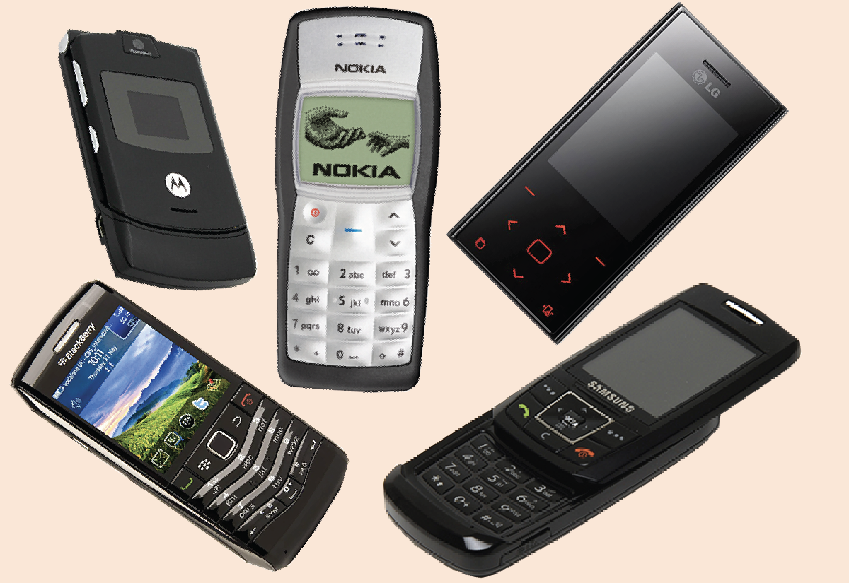
When I was a kid, I was a phone fanatic. I couldn’t get enough of phones because they were the most advanced technology I could afford.
I remember playing Snake on the Nokia 1100. I was addicted to that game. Now whenever I hear the Nokia tone, Snake comes to mind. It’s like a Pavlovian effect.
When I was in primary school, my friend brought the Motorola Razr to school. It was my first time to see such an advanced phone. The flip was mesmerizing. Then he played Nelly’s Dilemma on it. I couldn’t believe that actual music was coming out of the phone. When I reached home, I told my friends all about that experience.
In secondary school, another friend brought the BlackBerry Pearl. He told me he could send free text messages using BBM provided he sent it to another person with a BlackBerry. I was intrigued.
The Samsung E250 was the first advanced phone I ever owned. The sound that came out of that phone using the original earphones was unmatched. I remember having Jason Derulo’s Ridin’ Solo on repeat. I’m an iPhone guy now, but the Samsung E250 will always have a special place in my heart.
The LG Chocolate I owned briefly. It was an interesting phone, especially with an LED keypad. I loved showing it off to people because they’d never said anything like it.
Thanks for indulging me in recounting my adventures with phones, but this article is not about phones. It’s about how you can effectively communicate your message using data visualization.
The dataset
Did you know that the world’s best-selling phone is the Nokia 1100? I know. I also thought the iPhone had that spot but no – and it’s not even close.
I’ll use a dataset of phone sales for the five phones in the picture and walk you through the process of creating an effective visualization to communicate the message that the Nokia 1100 is the best-selling phone.
Now that we’ve got the data in a desirable format, let us create a line plot to communicate our message that the Nokia 1100 is the best-selling phone.
Default visualization
The default visualization below communicates the message contained in our data. However, it requires the audience to expend a lot of mental energy to get that message. That’s because the plot is too busy. For instance, it has many colors that don’t mean anything. This makes it difficult for the audience to get the message at a glance. They constantly have to shift their focus back and forth between the lines on the plot and the legend on the side to determine which phone represents what line. We can do better than this.
The technical term for this is data-ink ratio, which refers to the proportion of the plot’s ink displaying the actual data compared to the total ink used in the chart. Ideally, you want a high data-ink ratio. This can be achieved by emphasizing elements that contain the message you want to communicate and reducing elements that don’t. Thus, the focus should be on the lines of the plot and color should be used sparingly.
In the plot below, I’ve removed the legend and employed a technique called direct labeling. Having the phone name right at the end of the line it represents allows the audience to quickly see the sales trend of any phone.
fig = go.Figure()for phone in ["Nokia 1100", "Samsung E250", "LG Chocolate", "Motorola Razr", "BlackBerry Pearl"]: color ='blue'if phone =="Nokia 1100"else'grey' fig.add_trace(go.Scatter( x=df["Year"], y=df[phone], mode='lines+markers+text', name=phone, line=dict(color=color), text=[None] * (len(df["Year"]) -1) + [phone], # Show text only at the last point textposition='top center', textfont_size=10.5 ))fig.update_layout( xaxis_title="Year", yaxis_title="Sales", showlegend=False, # Remove the legend template="plotly", height=450, width=690, # Increase the width of the figure paper_bgcolor="#FFE8D6", plot_bgcolor="#FFE8D6",)fig.show(renderer="iframe")
You will notice that I have also used color sparingly and with intention. Remember, the message to communicate is that the Nokia 1100 is the best-selling phone; hence I’ve made the sales trend line for the Nokia 1100 blue. Our eyes are usually drawn to things that are different from the group. I’m nudging the audience to pay attention to the trend line of the Nokia 1100 sales by using a different color and the same color for the trend lines for all the other phones. Additionally, I’ve changed the background color to make the plot uniform.
Best visualization
We’ll ensure that the final visualization doesn’t only effectively communicate our message but is also aesthetically pleasing to the audience’s eyes. We’ll start by removing the label on the X-axis. We already know that 2006 or 2012 are years. There’s no need for a label to indicate that these are years.
from plotly_customizations import customize_plotly_figurefig = go.Figure()customize_plotly_figure(fig, f"{Path('../../../')}/images/logo.png")for phone in ["Nokia 1100", "Samsung E250", "LG Chocolate", "Motorola Razr", "BlackBerry Pearl"]: color ='blue'if phone =="Nokia 1100"else'grey' line_width =3if phone =="Nokia 1100"else2# Thicker line for Nokia 1100 text_color ='blue'if phone =="Nokia 1100"else'grey'# Set text color for Nokia 1100 fig.add_trace(go.Scatter( x=df["Year"], y=df[phone], mode='lines+markers+text', name=phone, line=dict(color=color, width=line_width), # Set the line width here text=[None] * (len(df["Year"]) -1) + [phone], # Show text only at the last point textposition='bottom center', textfont=dict(size=8.5, color=text_color) # Set text color here ))fig.update_layout( title="<b>The amazing sales of Nokia 1100<br>(2006 - 2015)</b>", title_font=dict(size=22), # Set title font size title_x=0.01, title_y=.94, yaxis_title="Sales", width=690, xaxis=dict( showgrid=False, # Remove grid lines tickfont=dict(size=14, color="#3d3846"), # Set x-axis label font size and color ), yaxis=dict( showgrid=False, # Remove grid lines tickfont=dict(size=14, color="#3d3846"), # Set y-axis label font size and color ), showlegend=False, # Remove the legend)fig.show(renderer="iframe")
Notice that the trend line for Nokia sales is thicker than the rest of the lines. Here I’ve altered one category of the preattentive attributes (form) by increasing the linewidth of the trend line that I want the audience to focus on. Preattentive attributes help us notice something without paying much attention to it. The fact that it’s different from the things within its surroundings catches our attention. Other categories of preattentive attributes include color, spatial position, and movement.
Lastly, I’ve provided a title to describe the main idea I want to convey in the visualization. The audience can simply read the title and know what the visualization is about.
Notice my company logo at the bottom right of the plot.
Now this is a better-looking plot. Wouldn’t you agree?
Warning
Simple does NOT mean less work. Notice how much code we had to write to produce a simpler and more informative plot.