I am a sucker for visually appealing things, and I try as much as I can to embody that in my data analysis work. In this article, I’ll show you how you can style your pandas dataframes to make them look pretty and enhance their message.
A highly styled dataframe
Why care about styling?
Styling allows you to change the look of the data in your dataframe columns while maintaining the data types. This enables you to perform mathematical operations on columns that may otherwise contain strings-like symbols like % and $.
The most common and straightforward example of styling is using currency symbols when working with monetary values. For instance, when you have 95.05, you likely won’t immediately understand it as a monetary amount. By contrast, when you see it as $95.05, the first thing that will come to your mind is that this is a monetary amount.
Percentages are another example of numbers whose message is enhanced when styling is used. Interpreting 7 percent is easier when it’s written as 7% than when it’s written as 0.07.
Pandas styling enhances the message of the values in your dataframe, making it easier for your audience to understand the message of those values. More importantly, it doesn’t change the data types of those values allowing you to perform mathematical operations on them.
The dataset
The dataset for this task will be the 2018 sales data for various companies in the United States.
Let’s extract summary statistics like the mean (average) and sum of the price data for the six random companies in our dataset. I’ll usegroupbyand agg methods to achieve this.
When you look at the data in the above dataframe, you notice that the summed values are significantly larger, and the averaged values have 6 decimal points. This makes it harder to understand the scale of the numbers, and the table isn’t aesthetically pleasing.
To solve these problems, we turn to style which converts the table from a pandas dataframe to a style object. The style object is not as rigid as a pandas dataframe, in that you can use format to change the look of its values.
I’ll use Python’s f-strings to convert the data into currency values and round them to 2 decimal places. If I wanted to round to a whole number (0 decimal places), I would’ve used this f-string ${0:,.0f}.
Let’s take our styling up a notch and deal with dates. I’ll use pd.Grouper to get the total sales for each month. Then I’ll calculate how much each month is as a percentage of the total annual sales.
I’m not interested in showing the date in its full format. Once again, I’ll use f-strings to display the date like “Jan-2018” instead of “2018-01-31”. I’ll also add the % symbol to the values in percentage total column. Now, let’s style the date to get the desired dataframe.
To use resample you must set the date column as the index of your dataframe.
If you have an observant eye, you’ll notice that the above dataframe doesn’t have an index. That’s because use used the hide method. It suppresses the index.
Manipulating the look of your dataframe is useful when developing final output reports. Usually, the index of the dataframe serves no purpose in the final report.
Colors can be useful when directing attention to specific parts of the report like the lowest or highest sales values. Let me highlight the highest and lowest values to see which months had the highest and lowest sales. I’ll use red for the lowest and green for the highest.
You can also use background_gradient to highlight the range of values in a column. Let’s do it for the sum column. I’ll use subset to pick the column and cmap to choose a color palette for the gradient.
In the code above I use bar and some parameters to configure the display of the bars in the columns. Using set_caption allows me to add a title to the table.
Advanced styling
All the styling we’ve done thus far can be exported to Excel and the styling will be reflected in the Excel file. Unfortunately, the advanced styling we’ll do from here won’t be maintained when the file is exported to Excel. Since the styling will involve HTML and CSS features, you can export it as an HTML file and the styling will be maintained.
Let’s create a table that shows the top 10 companies by sales value. Then we’ll get the average and median of their quantity; and average, median, and sum of their ext_price.
To create sparklines, I’ll use the library sparklines and numpy.
from sparklines import sparklinesimport numpy as np# function to create sparklinesdef sparkline(x): bins=np.histogram(x)[0] sl =''.join(sparklines(bins))return slsparkline.sparklines ='sparkline'# apply the function to modify the dataframedata = (df .groupby('name') .agg({'quantity': ['mean', 'median', sparkline], 'ext_price': ['mean', 'median', 'sum', sparkline]}) .head(10) )data.columns.names=['','Stats']# mapping for renamingrename_mapping = {'quantity': 'Quantity','ext_price': 'Price'}# renaming the levelsdata.columns = data.columns.set_levels( [rename_mapping.get(item, item) for item in data.columns.levels[0]], level=0)data
Quantity
Price
Stats
mean
median
sparkline
mean
median
sum
sparkline
name
Barton LLC
24.890244
28.0
▄▄▃▂▃▆▄█▁▄
1334.615845
1280.640015
109438.500000
█▄▃▆▄▄▁▁▁▁
Cronin, Oberbrunner and Spencer
24.970149
28.0
█▄▁▄▄▇▅▁▄▄
1339.321655
1123.500000
89734.546875
█▅▅▃▃▃▂▂▁▁
Frami, Hills and Schmidt
26.430556
28.0
▄▄▁▂▇█▂▂▅▅
1438.466553
1509.689941
103569.593750
█▅▄▇▅▃▄▁▁▁
Fritsch, Russel and Anderson
26.074074
27.0
▁▄▇▃▂▂█▃▄▄
1385.366821
1050.119995
112214.710938
▇█▃▄▂▂▁▂▁▁
Halvorson, Crona and Champlin
22.137931
19.5
▇▆▆▇█▁▄▂▄▃
1206.971680
925.434998
70004.359375
██▆▅▁▃▂▂▂▂
Herman LLC
24.806452
25.0
▄▃▅▁▆▄▂▆▃█
1336.532227
1095.489990
82865.000000
█▅▇▄▅▄▁▃▂▂
Jerde-Hilpert
22.460674
23.0
▄▄█▁▂▅▃▂▄▃
1265.072266
906.359985
112591.429688
█▄▅▂▁▂▃▂▂▁
Kassulke, Ondricka and Metz
25.734375
27.5
▂▂▁▁▂▂▁▅▄█
1350.797974
951.164978
86451.070312
█▆▆▄▄▃▂▁▁▂
Keeling LLC
24.405405
24.5
▁▄▇▃▅█▃▄▃▆
1363.976929
979.824951
100934.296875
▅█▆▃▄▂▂▁▁▁
Kiehn-Spinka
22.227848
21.0
▃▂█▂▃▅▄▁▄▁
1260.870605
894.960022
99608.773438
█▇▄▃▃▂▁▂▁▁
You’ll notice that the table above is multi-column i.e., there are two levels of columns. I’ll add sparklines to the second level of columns. These will be under both quantity and price. I’ll also rename the top columns as Quantity and Price . Then I’ll add a label Stats to show what the second level of columns mean.
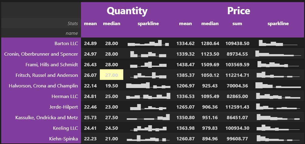
Let’s add some HTML and CSS styling to make our table more stunning. I’ll format all the numbers to 2 decimal places. The background color for the header will be purple and I’ll increase the font size for the names of the top columns.
# set the HTML and CSS stylescell_hover = { # for row hover use <tr> instead of <td>'selector': 'td:hover','props': [('background-color', '#ffffb3')]}index_names = {'selector': '.index_name','props': 'font-style: italic; color: darkgrey; font-weight:normal;'}headers = {'selector': 'th:not(.index_name)','props': 'background-color: #813d9c; color: white;'}# apply the HTML and CSS styling(data .style .format({('Quantity', 'mean'): "{:.2f}", ('Quantity', 'median'): "{:.2f}", ('Price', 'mean'): "{:.2f}", ('Price', 'median'): "{:.2f}", ('Price', 'sum'): "{:.2f}"}) .set_table_styles([cell_hover, index_names, headers]) .set_table_styles([{'selector': 'th.col_heading', 'props': 'text-align: center;'}, {'selector': 'th.col_heading.level0', 'props': 'font-size: 2em;'}, {'selector': 'td', 'props': 'text-align: center; font-weight: bold;'}], overwrite=False) )
Quantity
Price
Stats
mean
median
sparkline
mean
median
sum
sparkline
name
Barton LLC
24.89
28.00
▄▄▃▂▃▆▄█▁▄
1334.62
1280.64
109438.50
█▄▃▆▄▄▁▁▁▁
Cronin, Oberbrunner and Spencer
24.97
28.00
█▄▁▄▄▇▅▁▄▄
1339.32
1123.50
89734.55
█▅▅▃▃▃▂▂▁▁
Frami, Hills and Schmidt
26.43
28.00
▄▄▁▂▇█▂▂▅▅
1438.47
1509.69
103569.59
█▅▄▇▅▃▄▁▁▁
Fritsch, Russel and Anderson
26.07
27.00
▁▄▇▃▂▂█▃▄▄
1385.37
1050.12
112214.71
▇█▃▄▂▂▁▂▁▁
Halvorson, Crona and Champlin
22.14
19.50
▇▆▆▇█▁▄▂▄▃
1206.97
925.43
70004.36
██▆▅▁▃▂▂▂▂
Herman LLC
24.81
25.00
▄▃▅▁▆▄▂▆▃█
1336.53
1095.49
82865.00
█▅▇▄▅▄▁▃▂▂
Jerde-Hilpert
22.46
23.00
▄▄█▁▂▅▃▂▄▃
1265.07
906.36
112591.43
█▄▅▂▁▂▃▂▂▁
Kassulke, Ondricka and Metz
25.73
27.50
▂▂▁▁▂▂▁▅▄█
1350.80
951.16
86451.07
█▆▆▄▄▃▂▁▁▂
Keeling LLC
24.41
24.50
▁▄▇▃▅█▃▄▃▆
1363.98
979.82
100934.30
▅█▆▃▄▂▂▁▁▁
Kiehn-Spinka
22.23
21.00
▃▂█▂▃▅▄▁▄▁
1260.87
894.96
99608.77
█▇▄▃▃▂▁▂▁▁
This is the type of table you would want to display on your website. What’s more, it has cell highlighting when you hover over a cell.
Styling this final table required a lot of work, but I’m sure you’ll agree that it’s nothing short of beautiful. You almost can’t stop looking at it.